Loading

0

DexaFit NJ

Helping Users Learn More About Their Body

Role

UX/UI Designer

Timeline

Jan - May 2025

Skills
  • Next.js
  • Responsive
  • Wireframes
  • UX Research
  • Information Architecture
  • Prototypes
Team
  • Myself
  • 1 Founder / Stakeholder
  • 1 Developer
Tools
  • Figma
  • Miro
  • Notion
  • Webflow / React / Firebase / Airtable
DexaFit NJ Body Composition Analysis Platform

UX RESEARCH INSIGHTS

Before diving into wireframes, I conducted research by auditing similar companies, real customer reviews, and doing numerous sprints with the business owner. This revealed key insights:

  • Users cared most about ease of booking and interpretation of results.
  • Confusing medical terminology discouraged first-time visitors.
  • Most users accessed the site on mobile, often from gym parking lots or in between appointments.

INFORMATION ARCHITECTURE

I created a content hierarchy that reduced decision fatigue and made navigation feel intuitive, especially on mobile. Top-level sections prioritized:

  • Book Now → front and center
  • Services → with visuals and plain-language explanations
  • FAQs + Prep Info → for peace of mind before the scan
  • Profile customization → accessible in 1 tap

Visual Language

I developed a modern, health-focused aesthetic that blends DexaFit's brand tone with calmness and trust:

  • Clean sans-serif typography for readability
  • Soft neutral blues + performance-driven accent colors
  • Visual breathing room and clarity to counter "overwhelming fitness app" syndrome

Mobile Experience First

While fully responsive, the experience was mobile-first by design:

  • CTA buttons placed within thumb zones
  • Fixed nav for quick access to booking
  • Collapsible sections and accordions to minimize scroll fatigue

The Problem

Users struggled with complex medical terminology and confusing booking processes. The existing site was overwhelming and didn't prioritize the most important actions users wanted to take.

Skills

Next.js Responsive Wireframes UX Research Information Architecture Prototypes

Tools

• Figma

• Next.js

• Miro

• Chart.js

• Notion

• Firebase

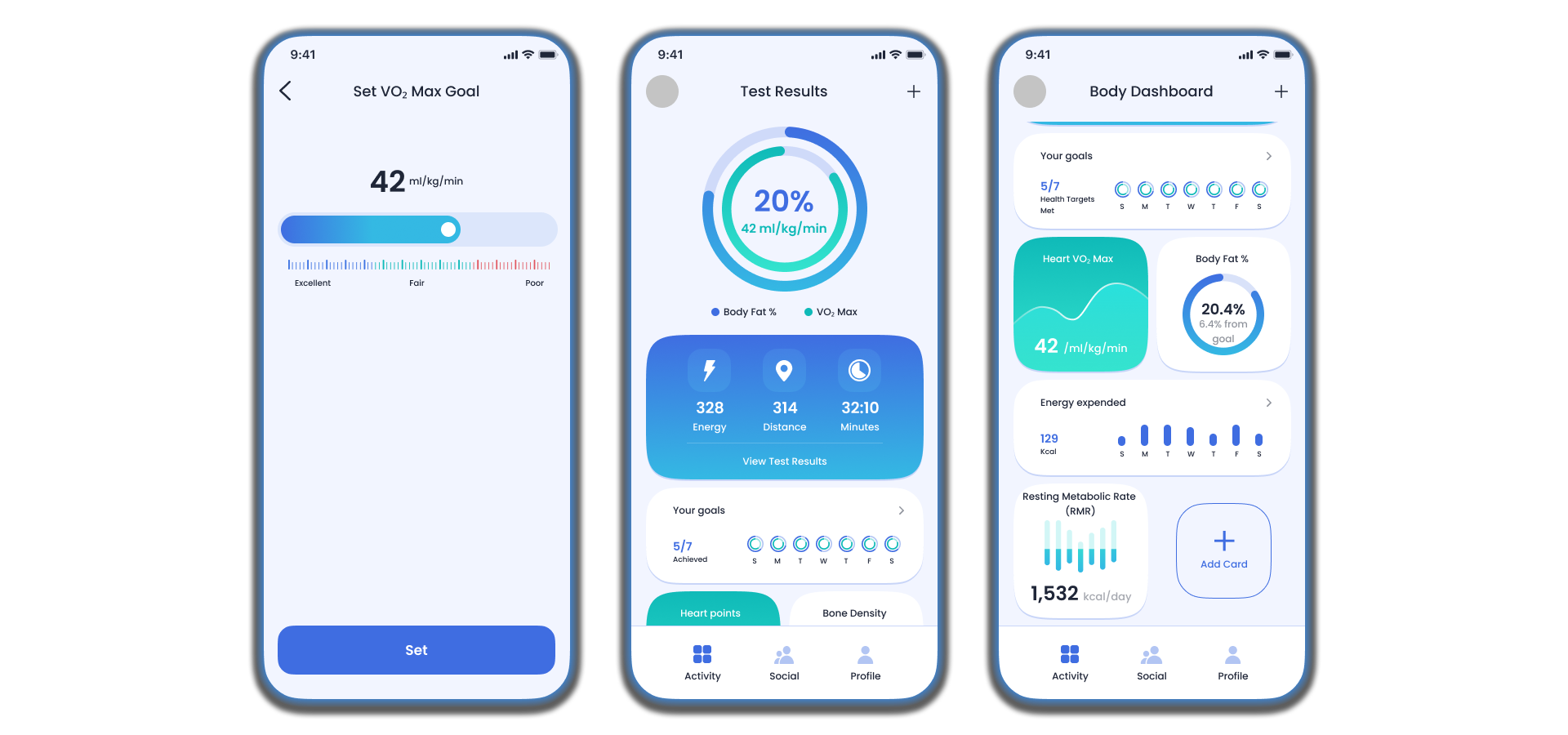
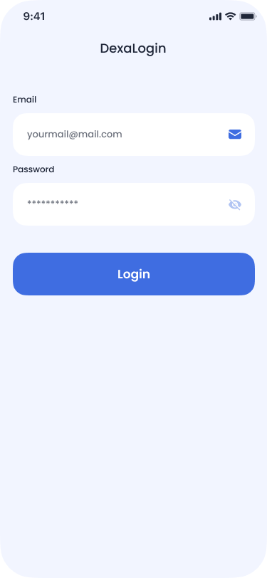
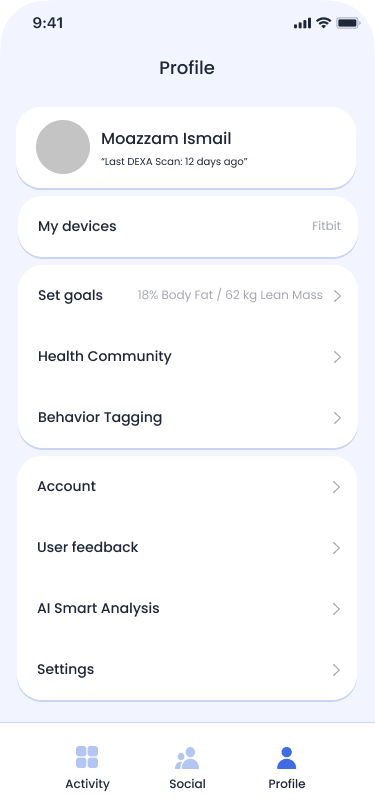
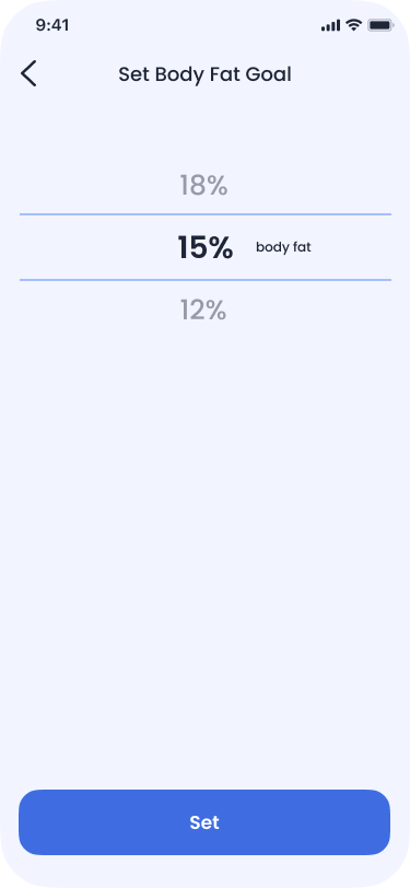
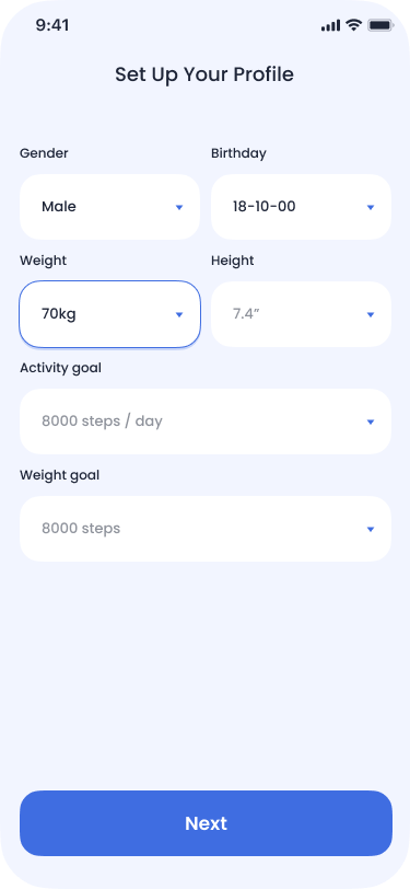
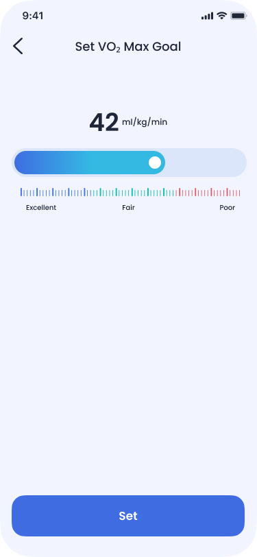
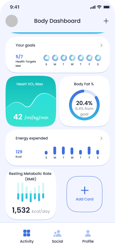
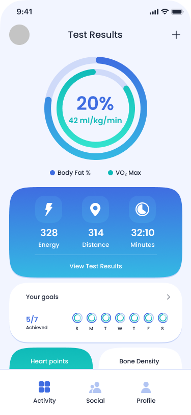
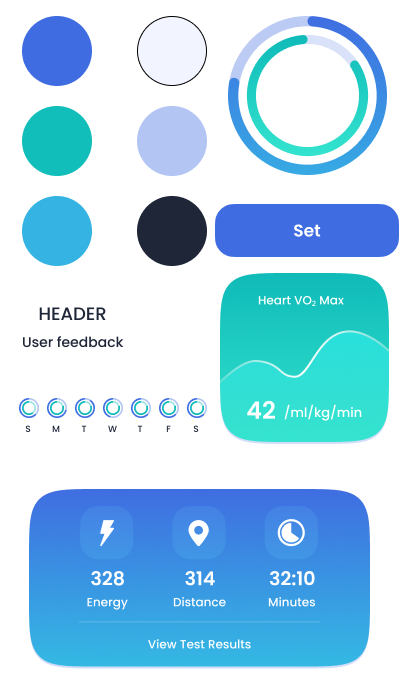
Design System & UI Screens

Key UI screens and components

Login
Profile
Set Activity
Set up Profile
Set Weight
Activity 2
Activity
UI Components

Impact

Measurable results and user outcomes

2,500+
Scans Completed
Users successfully completed their full scan analysis
98%
User Satisfaction
Positive feedback on data clarity and recommendations
40%
Increase in Bookings
Improved booking conversion through streamlined UX
95%
Task Completion Rate
Users successfully navigated core platform features

WHAT I'D IMPROVE NEXT

If we had more time or user data, I'd explore:

  • A repeat-booking shortcut for returning clients
  • Microcopy A/B testing for trust language ("Book now" vs. "Reserve your scan")
  • Explore the monotony of the AI Assistant and what to improve.
  • Client dashboard for tracking past results with filters or upcoming appointments