COLOR SWITCHER


FluxOps Internal SaaS Dashboard
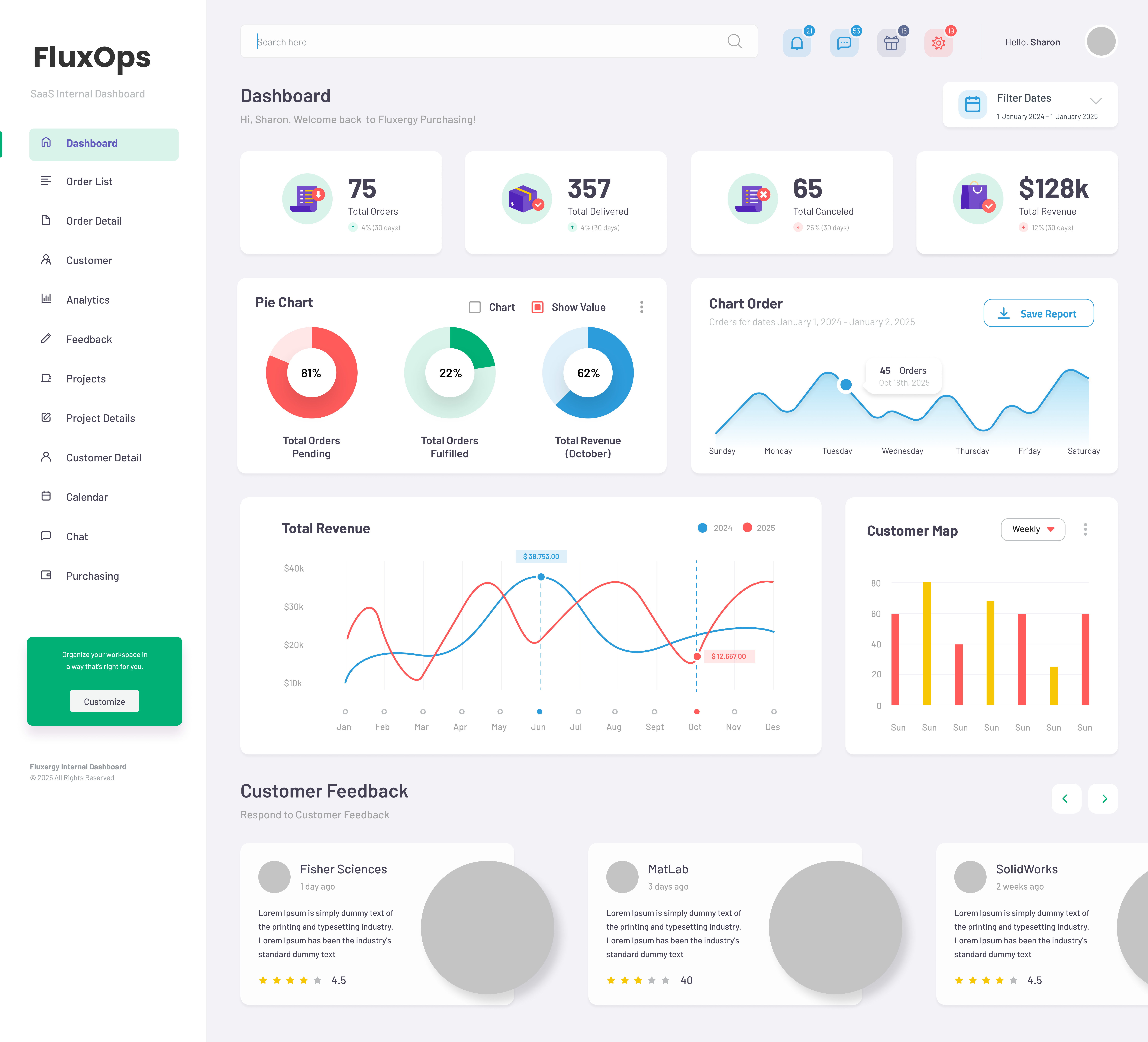 Dashboard Overview
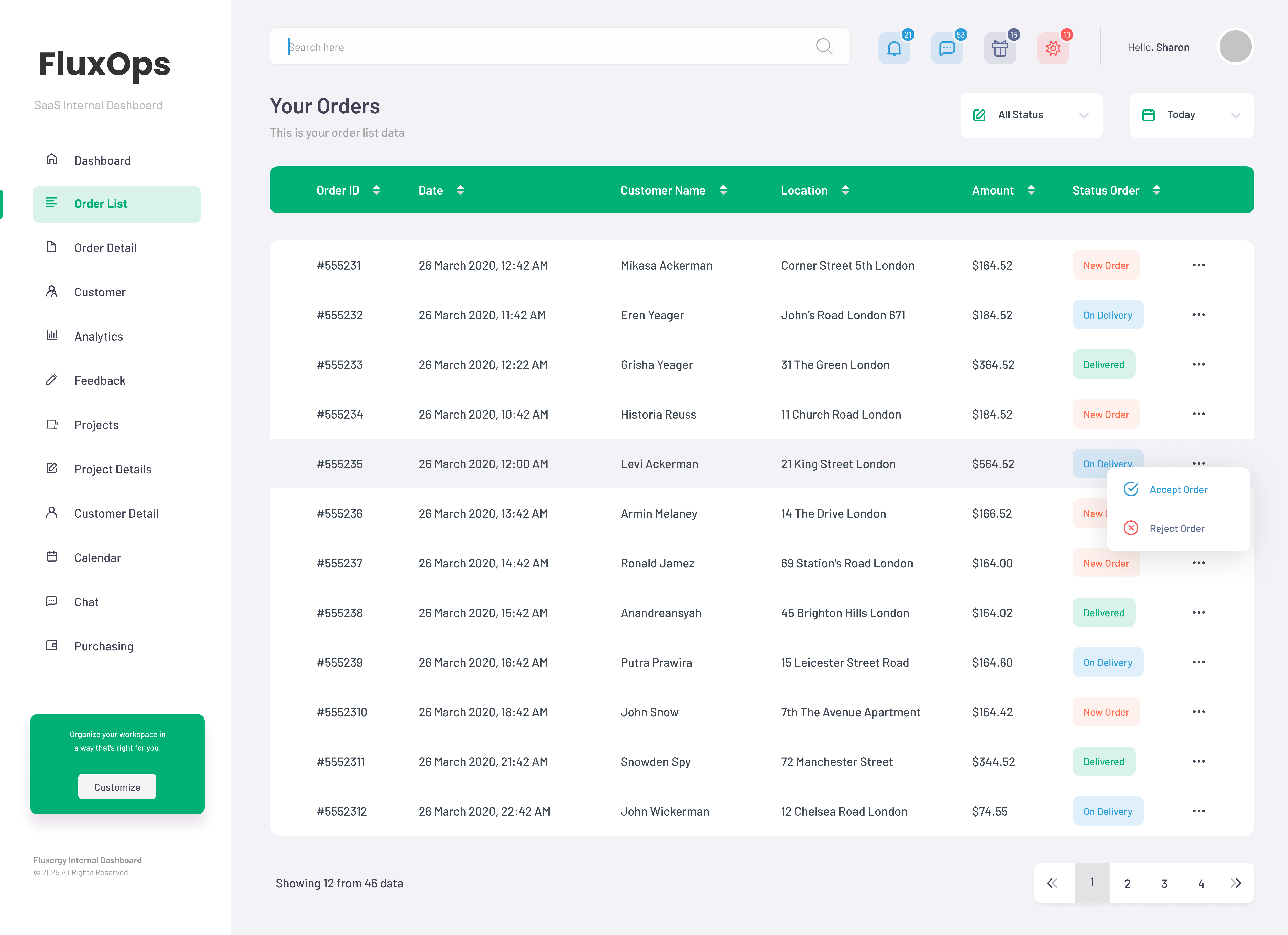 Order Management
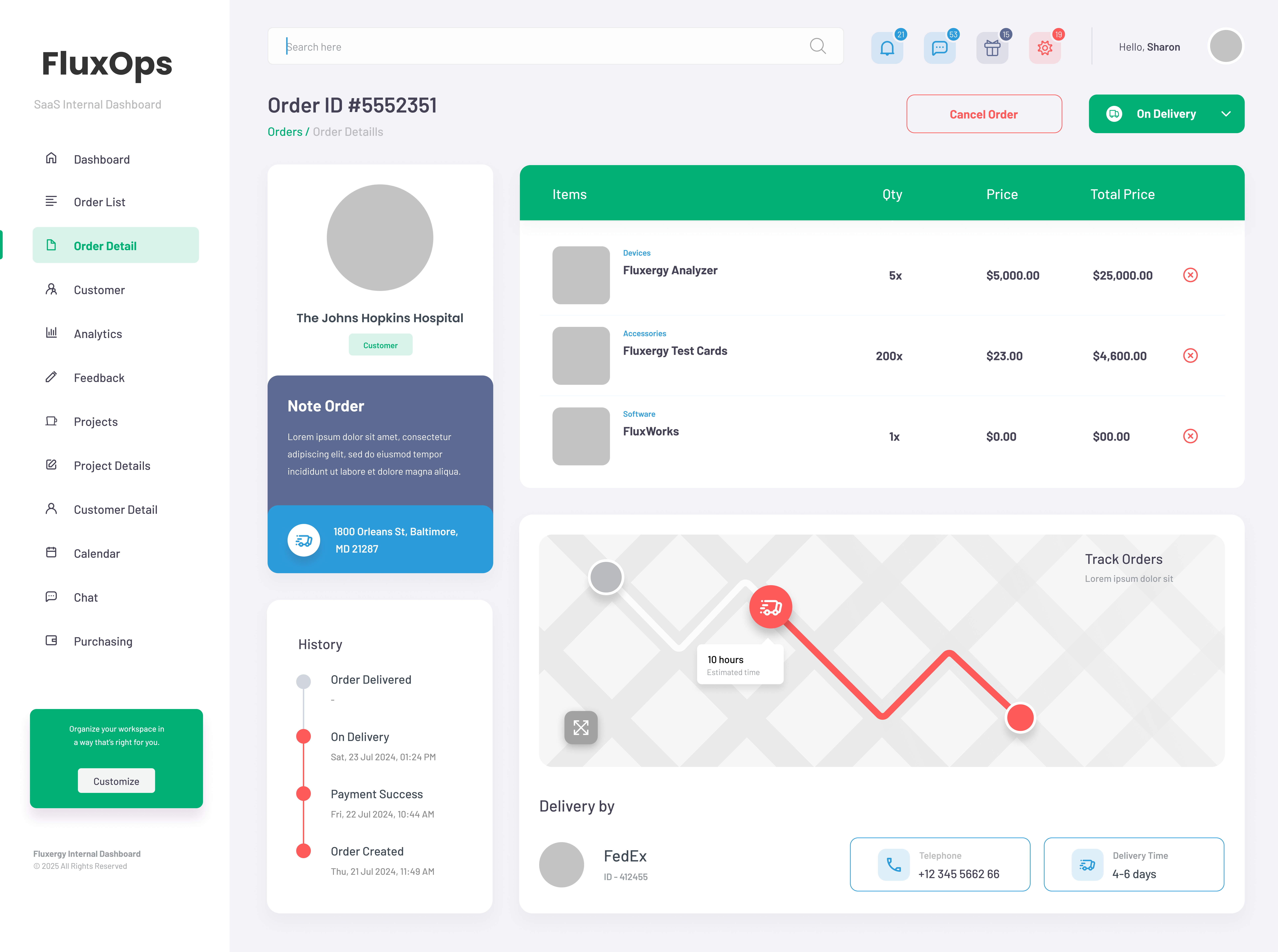 Order Details
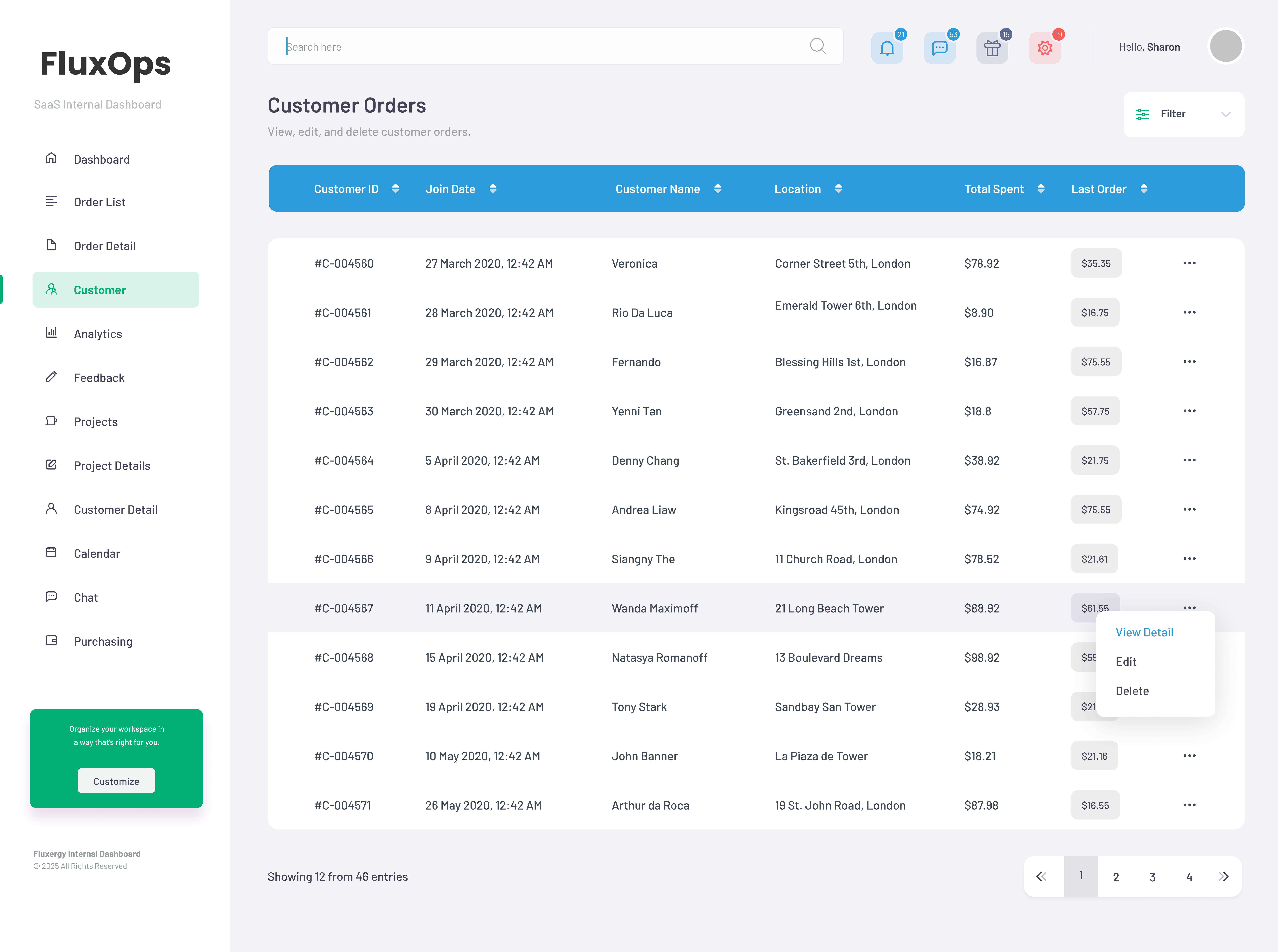 Customer Management
 Analytics Dashboard
 Review System
 Project Overview
 Project Details
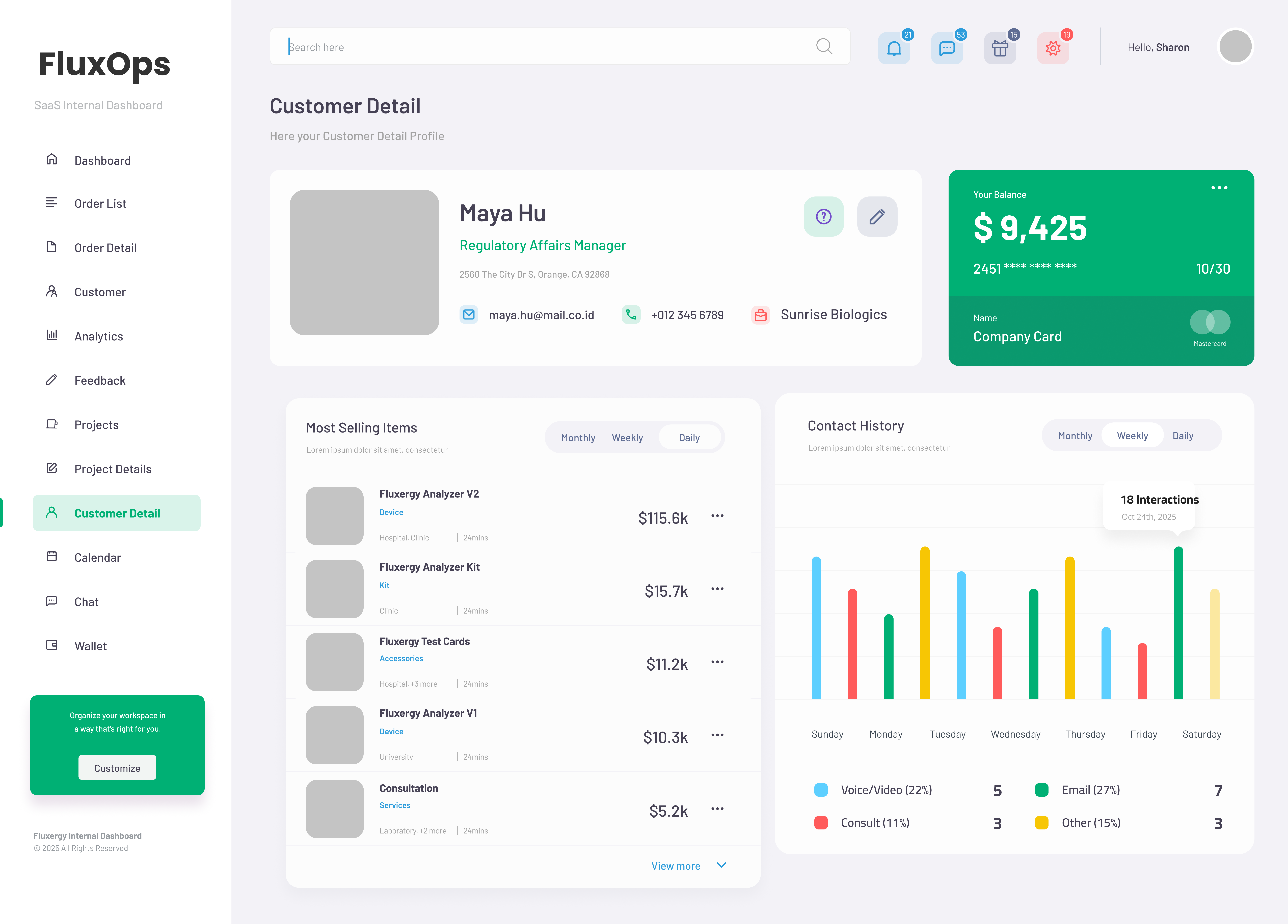 Customer Profile
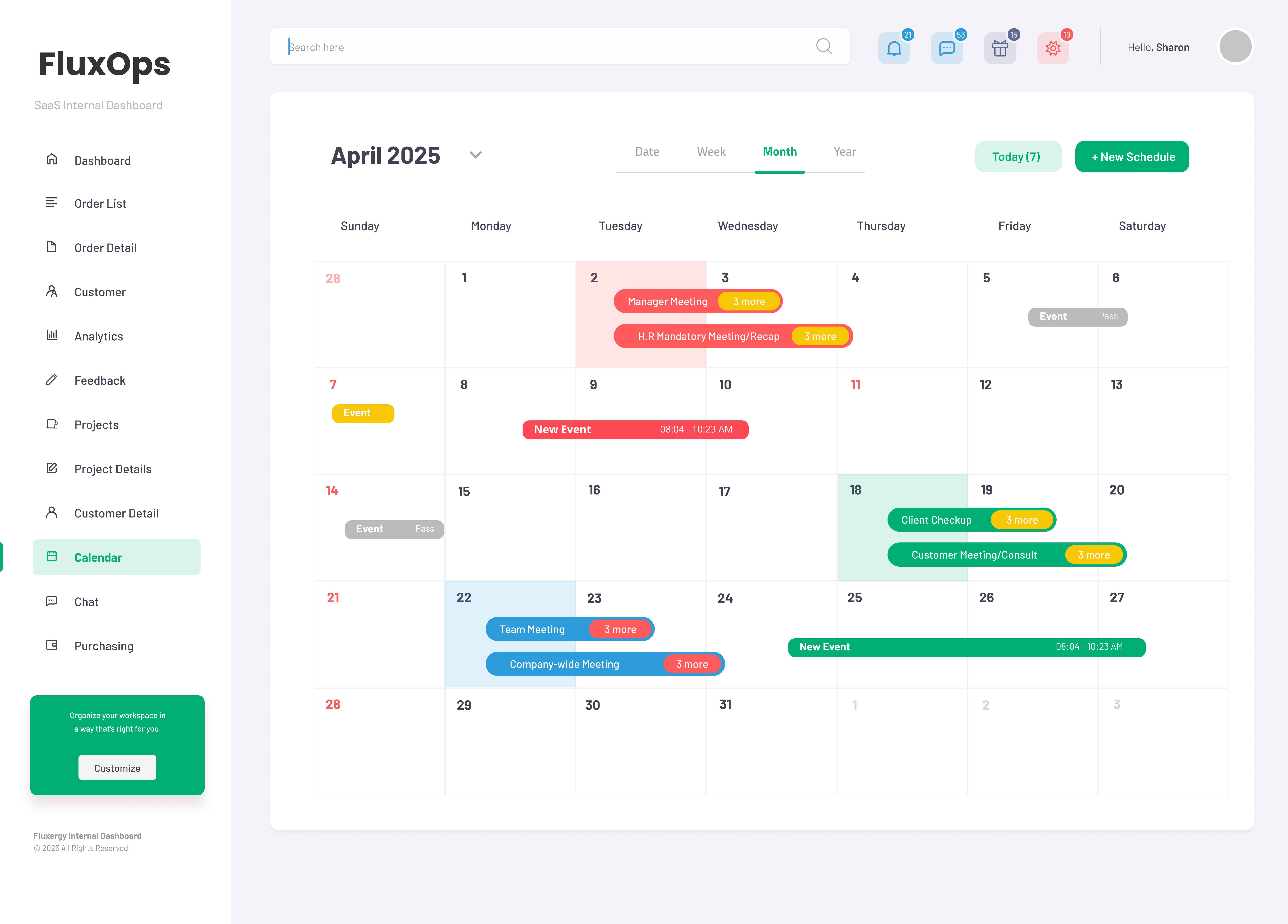 Calendar Integration
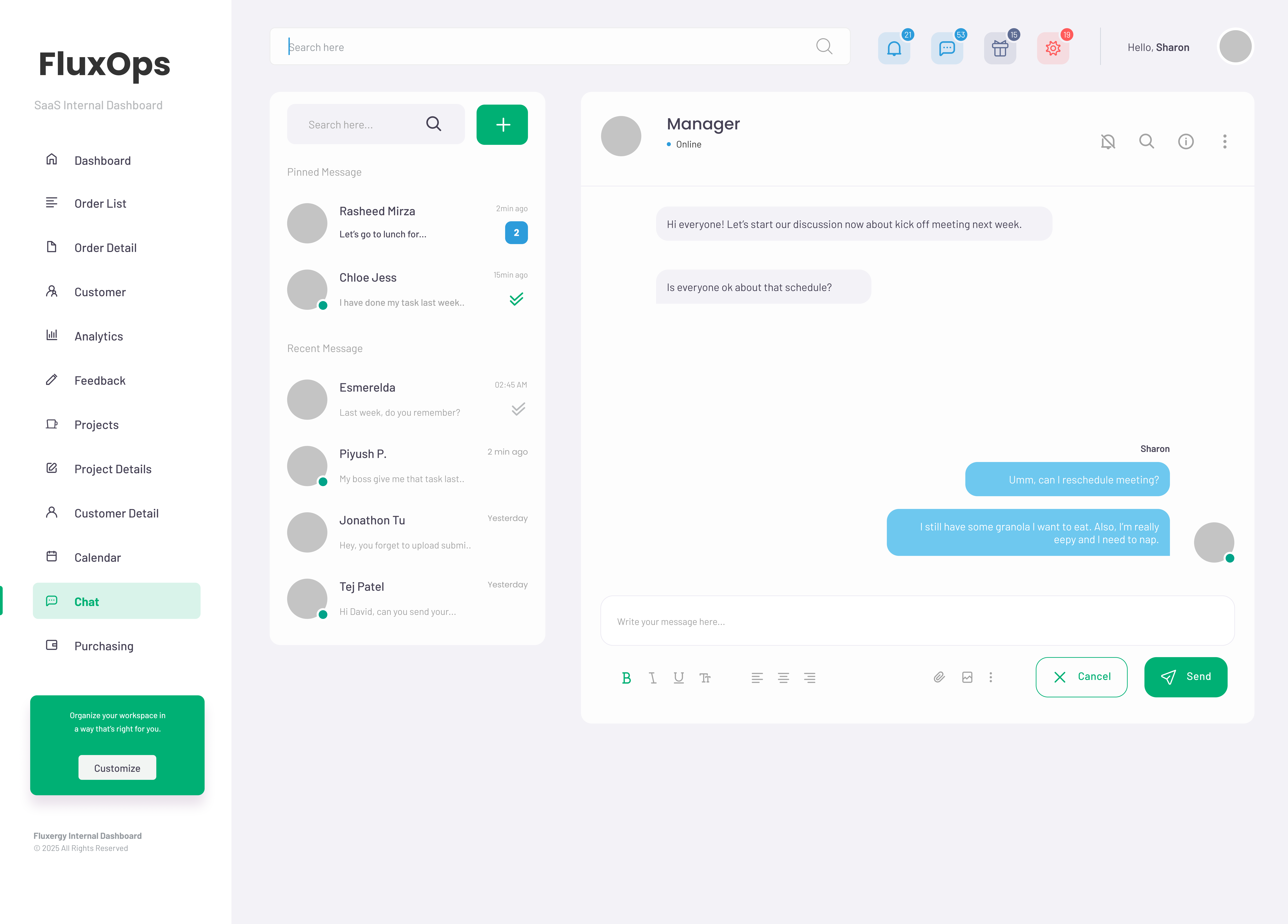 Team Communication
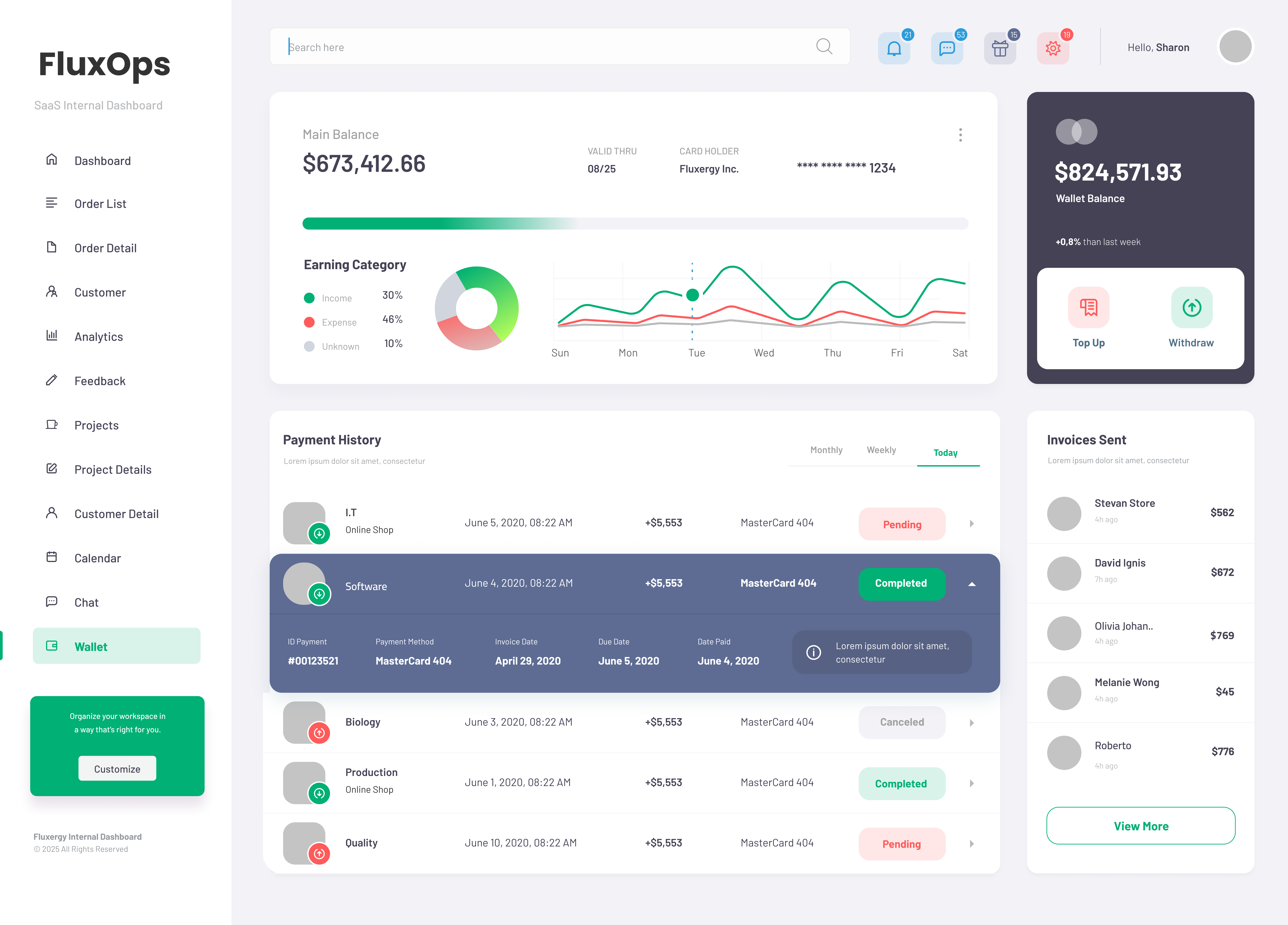 Financial Dashboard
Context & Problem
FluxOps is an internal dashboard that replaced scattered email approvals with organized queues across purchasing, legal, sales, lab, finance, and executive teams. Before this, approvals sat in individual inboxes and no one could see where requests were stuck.
This scattered approach meant delays, lost requests, and constant "what's the status?" emails. Teams couldn't track anything and audits were a nightmare of digging through email threads.
Information Architecture
The left menu puts daily tasks first. Every department uses the same card layout and buttons, so once you learn one section, you know them all.
- Most-used features are at the top so you don't have to hunt for them
- Dashboard cards show key numbers with simple up/down arrows
- Every table works the same way with the same buttons in the same places
- You only see the features your role actually needs
Approach
Discovery
- Interviewed department heads to map how requests moved and where they stalled
- Tracked approval paths to find the biggest bottlenecks
- Watched people use the old PowerApps system to see what frustrated them
Design
- Put the most-used features up front in the navigation
- Used card layouts so statuses were easy to scan at a glance
- Hid complex details behind clicks to keep the main view clean
- Made a dark theme that was easy on the eyes for all-day use
Delivery
- Built separate modules for each department that worked the same way
- Made status changes instant so people didn't have to wait for page reloads
- Added detailed logs so audits would be automatic
- Rolled out one department at a time so teams weren't overwhelmed
Results
- 80% faster approval times for purchase requests
- 90% reduction in "where's my approval?" emails
- 100% audit compliance with automated logging
- One system instead of 12 different tools
My Role
As the lead designer and developer, I worked closely with stakeholders across the company to understand pain points and design a solution that would work for everyone. I conducted user research, created wireframes and prototypes, and led the development effort to build the new system.
Timeline / Team / Tools
- Role: Product Designer and Developer
- Timeline: Jan–Apr 2024
- Team: COO, Legal Director, R&D Head, Sales VP, IT Manager, Finance Controller, Quality Lead
- Tools: Figma, FigJam, Jira, PowerApps, React, Node.js
Purpose of Design
FluxOps was designed to make busy work obvious and fast. Layout, type, and icon cues are simple on purpose: you see what changed, what's blocked, and what to do next. The result is less hunting, quicker decisions, and fewer "status?" messages.
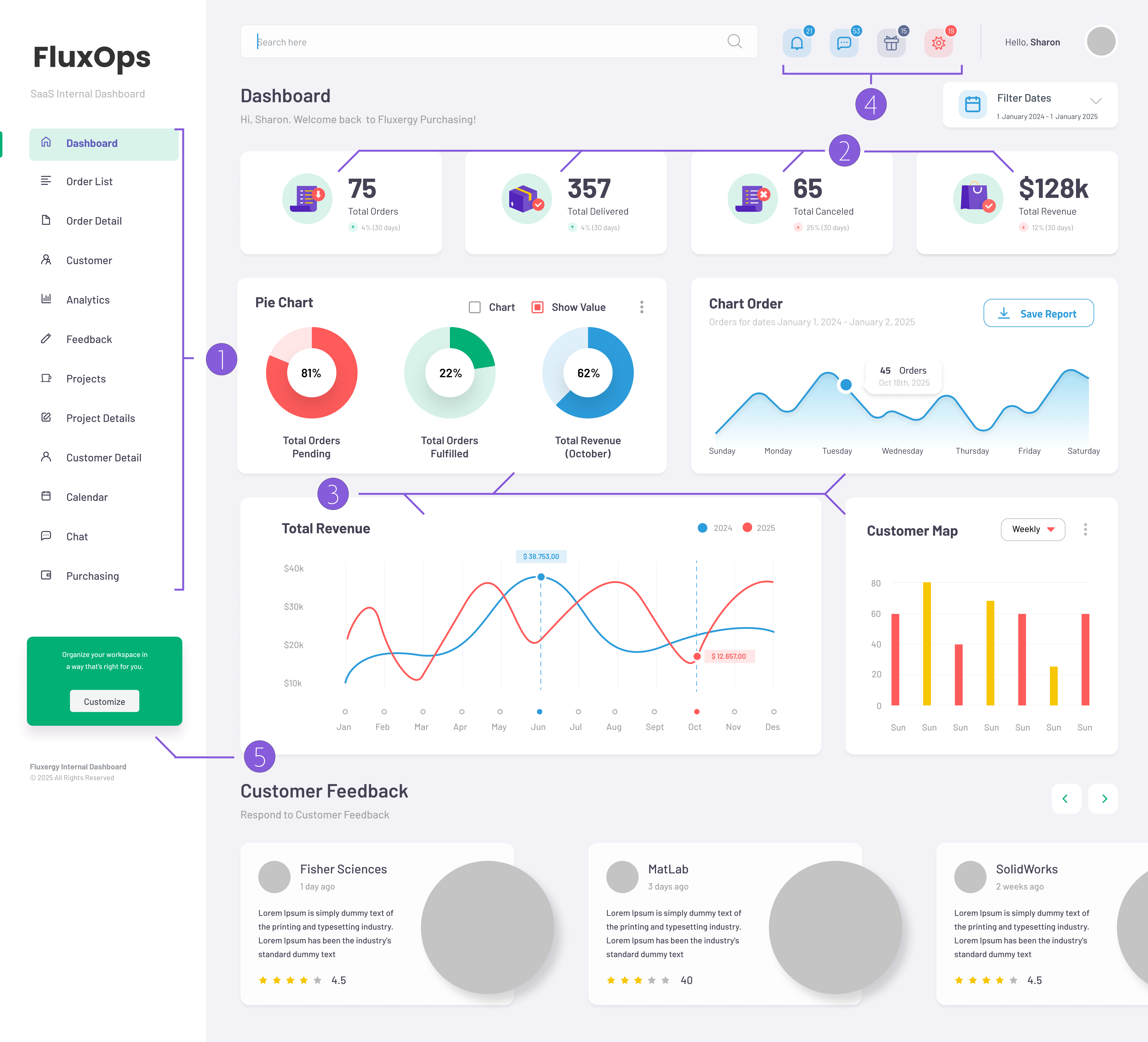
Sidebar Navigation Structure
Designed with persistent left-aligned navigation to reflect the frequency and priority of daily tasks. Grouped logically to support operational workflows and reduce cognitive load for users switching between roles.
Metrics Overview Cards
Used compact, glanceable summary cards with iconography and trend indicators to highlight KPIs. Color-coded deltas subtly guide the user's attention to what's improving or declining without overwhelming.
Revenue Trend & Analytics Panel
Built around executive visibility. The timeline chart is placed prominently to offer quick insight into business performance, with dual-line comparison across years for contextual grounding.
Utility Panel
Placed global actions (notifications, messages, settings) in the top-right for universal access without disrupting the visual hierarchy. Icons were prioritized over text to save space and encourage recognition.
Customer Feedback Preview
Added a real-time feedback component to make customer sentiment accessible within the dashboard, keeping the voice of the customer close to decision-makers without switching tools.
Impact
People stopped switching between tools and approvals became predictable instead of mysterious.
- No more "what's the status?" meetings because everyone could see everything
- Approvals went from taking days to taking hours
- Compliance audits became automatic instead of manual detective work
- Adding new departments was easy because the system worked the same way
Outcomes
- Executive meetings went from 3 hours to 45 minutes because everyone had the same data
- Compliance reports became automatic instead of manual digging
- Teams could see what other departments were doing without asking
- New hires learned the system faster because everything worked the same way
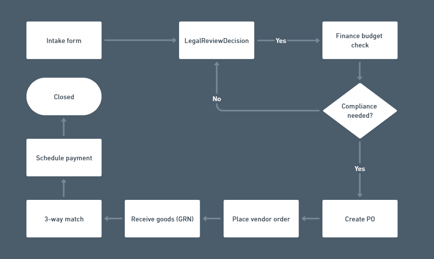
Workflow Modules
Reflection & Future Changes
What I'd Do Earlier
- Start with a small shared design kit before building screens.
- Solve the tricky table stuff early (sorting, editing, big lists, export).
- Get real data from the start to test performance with real-world loads.
Next Steps
- Send alerts when something waits too long and auto-nudge or escalate.
- Let each team manage who has access to what.
- Add more automation for common approval paths.
- Build a mobile app for approvals on the go.