COLOR SWITCHER


Ranna - Website and Digital Rebrand
Context & goals
Ranna is a neighbourhood Indian restaurant in the UK with a spice-forward menu and loyal locals. The food is bold and comforting. The website needed to feel the same: clear, quick, and welcoming for anyone checking the menu or ordering online.
Ranna needed a reset: the site felt dated, clumsy on phones, and inconsistent by location. The owner wanted a bold, fiery look and a faster path to "Order Online." I led the front-end/UX and graphic work to simplify ordering and refresh the brand.
Devices & accessibility
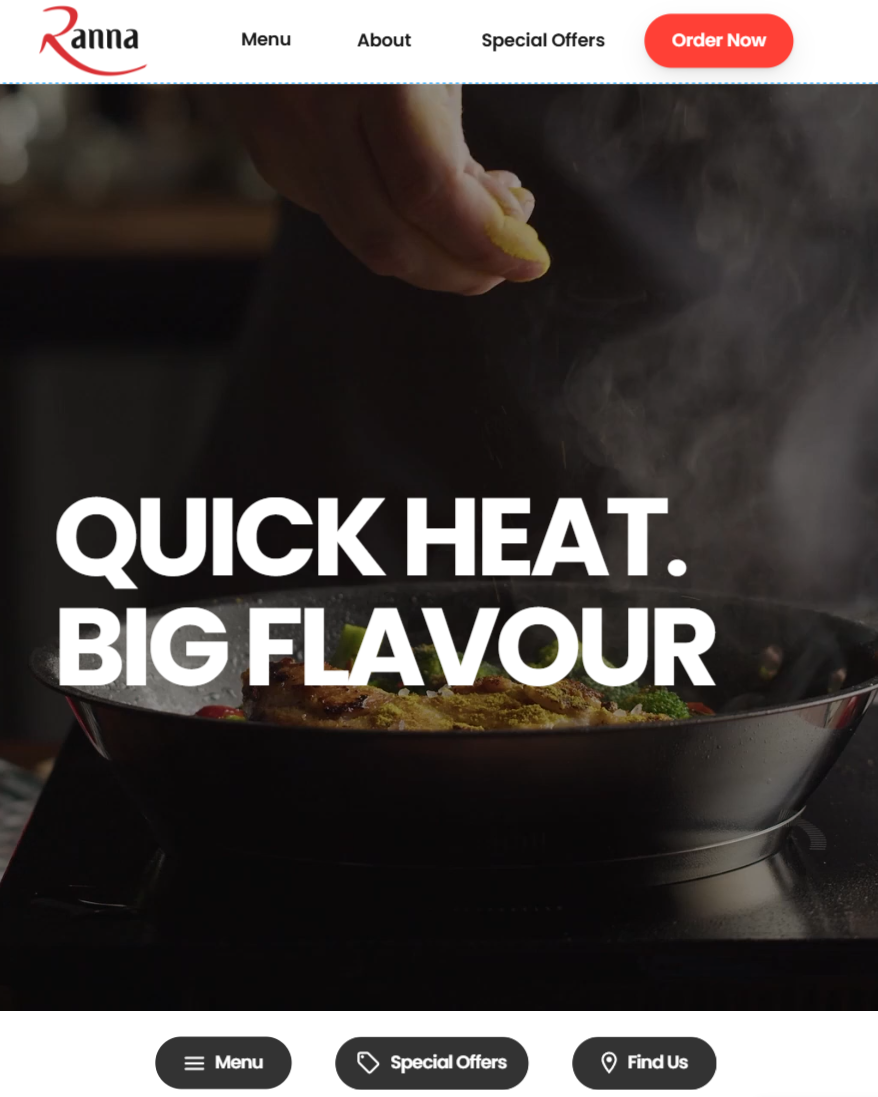
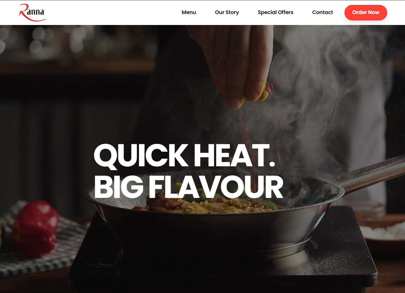
The website was engineered for universal access, offering a consistent and responsive experience across all devices.

Desktop
Tablet
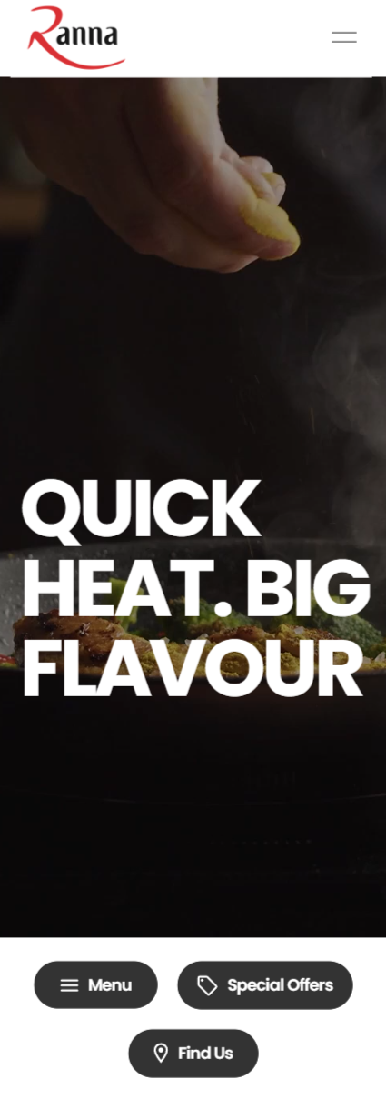
Phone
Role / timeline / team / tools
- Role: Framer UX, frontend, graphic design.
- Timeline: Aug–Sep 2025.
- Team: Afzal, Hanif, owners.
- Tools: Framer, Figma, Photoshop/Illustrator, Next.js, CSS.
- Not included: hosting, payments, backend.
Checklist
- One clear hero CTA to start an order.
- Menu visible above the fold on all devices.
- Simple branch picker: location → pickup/delivery → menu.
- Consistent YumaPOS deep links for every dish.
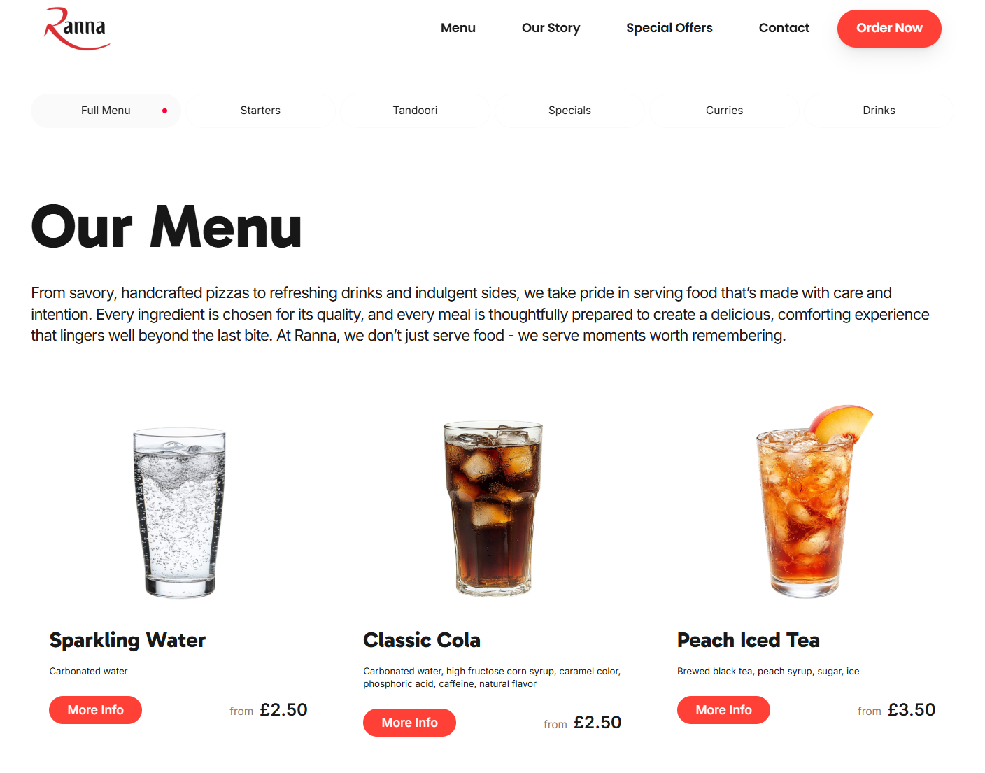
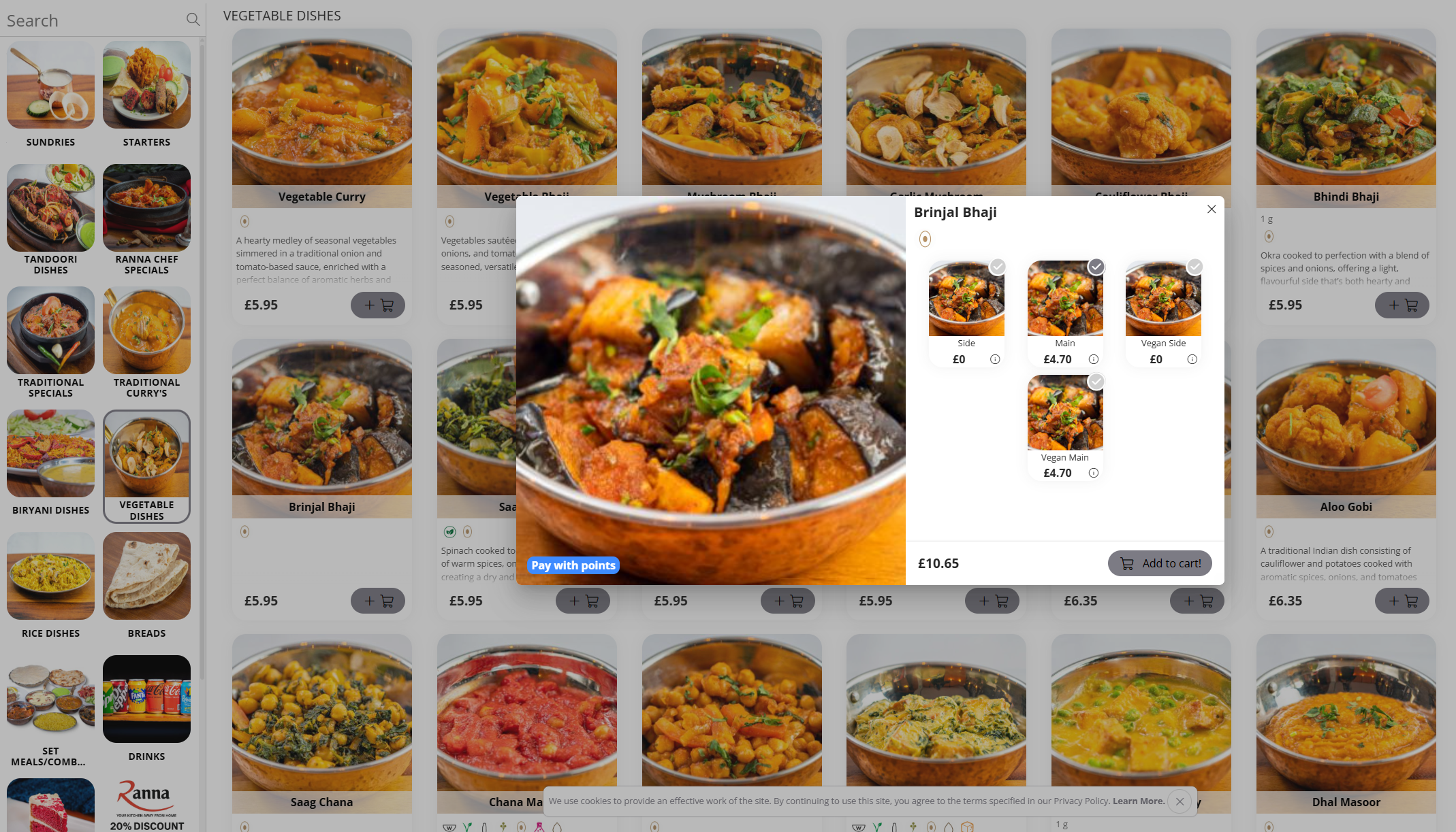
- Dish cards show allergens, spice, kcal, price.
- Faster loads: compressed video and lighter images.
- Palette: red for action; black/white base; warm yellow accents.
- Type scale that reads well on small screens.
- High-contrast buttons and icons; fewer choices per step.
Design references - what we kept, what we skipped
We reviewed a small set of clean templates and UI kits with the owner. The aim was to agree on spacing, pace, and how "Order Online" should feel. We kept the useful patterns and skipped anything that slowed the flow.
Applied from references
- One primary action per screen.
- Left-aligned headlines; short helper text.
- Header fixed to the container width.
- High-contrast buttons and chips.
- Filters visible on first scroll.
- Dish cards show allergens, kcal, price.
Skipped on purpose
- Heavy animations that add delay.
- Stacked CTAs competing in the hero.
- Crowded carousels and promo badges.
- Long story blocks above the menu.
- Low-contrast dark-on-dark palettes.
What to look for in the images
- Clean headers with a clear "Order Online".
- Filter chips placed before the grid.
- Card hierarchy: name → price → facts.
- Consistent icon sizes and button weight.
How this shaped Ranna
- Bold red for actions and key links.
- Black/white base to let food lead.
- Yellow accents used sparingly for spice cues.
- Card density tuned for thumb scanning.
- Mobile first; desktop keeps the same flow.
Color and typography
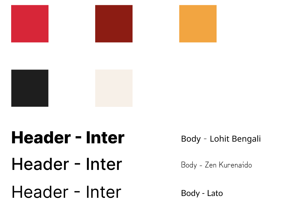
Early color and type explorations with the team.
Our team brainstormed color and typography approaches to balance bold action colors with readable text across all devices. We tested various red tones for appetite appeal, explored font weights for hierarchy, considered contrast ratios for accessibility, and evaluated readability on mobile. Ultimately, we selected a bold red for primary actions and links, paired with white/black for clean backgrounds, and subtle yellow accents for spice. Headlines are left-aligned with strong weight, and body text is readable at small sizes.
- Red = primary action and key links.
- White/black = clean base for photos.
- Yellow = spice accents, used lightly.
- Headline left-aligned, strong weight.
- Body type readable at small sizes.
Outcomes
Our redesign made ordering simple and consistent across locations. The new hero and clearer menu reduced second-guessing, so more people started an order right away and fewer dropped off on the menu. Dish facts and cleaner visuals built trust, and the site felt faster on phones. The brand now matches the food-bold, warm, and easy to navigate-which the team says has cut “how do I order?” calls and encouraged more repeat visits.
UI Showcase
- Implemented user testing insights for hero section layout, prioritizing clear messaging.
- Focused on a single, prominent call-to-action to guide user engagement.
- Relocated less critical information (e.g., reviews) below the fold to improve initial focus.
- Designed service presentation based on user feedback for clarity and appeal.
- Ensured visual hierarchy effectively guides users through available services.
- Optimized content placement to highlight key offerings and encourage exploration.
- Incorporated client feedback to refine navigation hierarchy and information architecture.
- Enhanced logo visibility and sharpness for brand consistency.
- Streamlined button labels to improve user comprehension and call-to-action effectiveness.

- Revised testimonial display for improved trustworthiness and impact.
- Ensured prominent placement of client feedback to build credibility.
- Focused on clear, concise presentation of testimonials for easy readability.
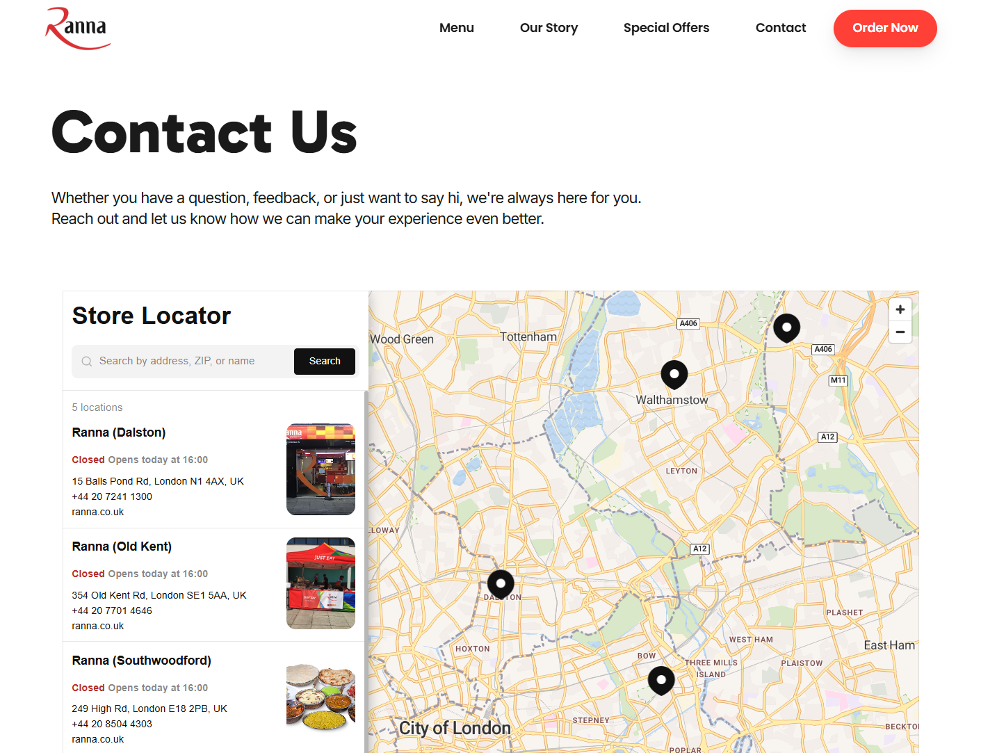
- Optimized contact form design for enhanced user experience and submission rates.
- Ensured all necessary contact information is easily accessible.
- Streamlined the contact process based on user feedback to minimize friction.
What I learned
Writing the copy first clarified screens and states.
- Limiting choices reduced hesitation and backtracks.
- Framer variants sped up changes across breakpoints.
- Standard 16:9 exports kept thumbnails readable.
- Asset compression improved page speed on mobile.
- POS deep-link patterns reduced routing errors.
How it went
Short cycles, honest feedback, steady wins.
- Weekly reviews → faster decisions.
- Feedback → changes: header, hero, buttons.
- Fewer “how do I order?” calls.
- Branch flow clearer for staff.
- Shipped essentials first; polished after.
- Brand now matches the heat.